Thursday, May 31, 2012

My Top Ten List... Books 7 and 8

I have to admit that I’d never heard of Thomas Hobbs… florist, garden designer, television host and now plant breeder… until I discovered his second book: The Jewel Box Garden in a specialty bookshop.  The Jewel Box Garden led me to his first book, Shocking Beauty, which led me to his website.
Thomas’ books read like conversations with a good friend… a little disjointed, a little bitchy, very personal and totally honest.  They encourage us to draw inspiration from the grandest and most fantastical of gardens, stage theatrical scenes (with plants, of course) and only plant what we absolutely love.  As Thomas suggests “Non-contributors are a waste of money and space.”  Why spend energy caring for a ho-hum plant just because it’s what you think you “should” be growing?  Branch out (pun intended)!  Your garden should reflect your personality.
Thomas started breeding his own Daylilies to capture all his favorite elements of the plant.
His first introduction 'Connie Casserole'
is an unusual warm and citrusy color with ruffly, crimped petals.
I’m not sure if Thomas and I share a lot of personal traits, but I certainly appreciate his preferences in the garden, including
the idea of haziness;
  • Thomas uses ornamental grasses and more ethereal plants to create a fuzziness throughout the garden.
  • Sunlight and dew heighten the romance of the haze.
visual tension;
  • Thomas often accomplishes tension with dramatic foliage in electric colors, colors that seem slightly “off” or just on the edge of another… lime-yellow, almost-purple red, misty blue-gray… or with sharp variegation.
Naturally-occuring technicolor!
This Barberry and Spirea both contrast and complement one another.
The emerging Spirea blossoms mirror the rosy tones of the Barberry foliage.
'Coral Drift' Rose in the foreground with 'Spilled Wine' Weigela
and a bright chartreuse Thuja.
portable gardens;
  • Thomas was a florist before he moved into garden design, and both his containers and the way he clusters them are stunning.
  • I’m beginning to use more pots and planters out in my garden.  It’s a great way to add small shrubs to some of the more established areas.
  • Plus I like that containers bring shorter shrubs closer to eye level.
and tightly planted beds and pots.
  • Thomas belongs to the “no bare ground” school of gardening, which is beautiful, but can make for very high maintenance.
A small, weeping Loropetalum, pinky, variegated Barberry
and bronzy Physocarpus blend together in a blur of burgundy and red!
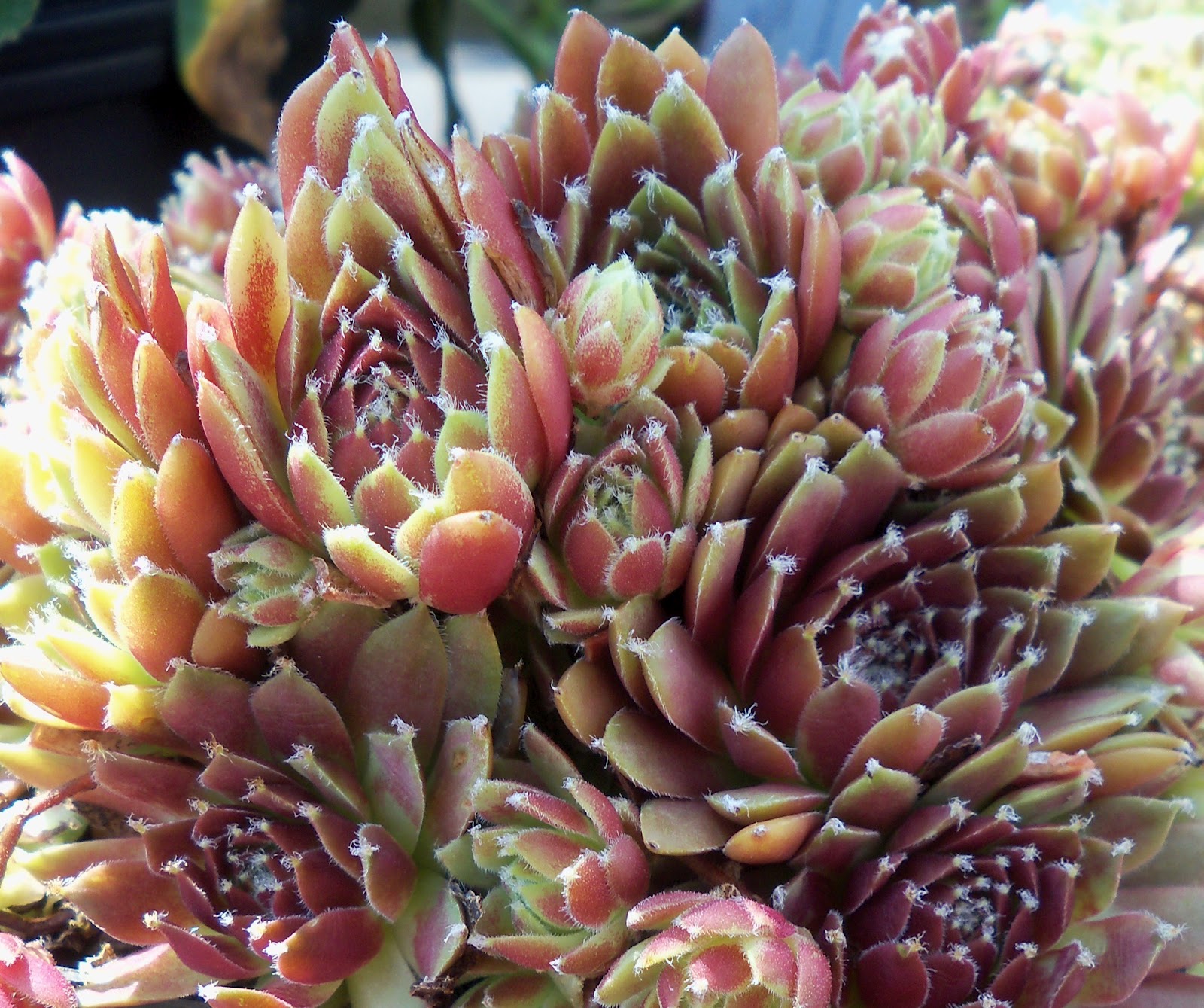
Well, no guts, no glory!

Thomas is up in Vancouver, and the mild climate allows him to grow so many interesting plants.  He especially likes varieties of Coleus, Canna, ornamental grasses, Sedum, Sempervivum and Echeveria that are barely hardy in the Pacific Northwest and would never survive our erratic winters in Central Virginia.
It also means I probably won’t have a chance to visit his Southlands Nursery any time soon.  But Shocking Beauty and The Jewel Box Garden continue to inspire me to push limits in my own garden.

Thursday, May 24, 2012

A Good Frame-Up

Franky and Meridith’s foyer has kind of developed over time.  And we’ve been able to carefully choose each item we add to the décor, including the wonderful photograph by Jeremy Kohm and its custom frame.

I find a lot of folks are intimidated by custom framing and often consider it “too expensive”.  So, I thought it might be helpful to share how we made decisions in this custom project and show how this piece was fitted and framed.

Franky and Meridith’s foyer is a mixture of old and new, sleek and slightly worn, down-to-earth and glamorous.  And we wanted to continue that dichotomy in the frame details.  So we chose a very simple wood frame with a beautiful hand-rubbed glaze and light distressing and asked that the mat bevel be edged in gold.

This simplicity both offsets and lends to the elegant Art Deco swimming pool, the gilded tones of the marble and pendant lights and the cool stillness of the water.  The large mat accomplishes two objectives: it endows the whole piece with a little heft, a greater visual importance in the rather large open foyer, and gives the image breathing room… if that makes sense.
A good frame shop should offer hundreds, if not thousands of frame and mat options, and its staff members can help you make similar decisions for framing your art and collectibles.  I think it’s important to consider where your art will be hung.  Are lamplight, sunlight and/or humidity issues?  How do you feel about glare?  And of course, there are many traditions and ideas about the proper look of framed prints, photographs, paintings, textiles and mirrors.  But ultimately, the decision is yours.

My sister is a framer, and she and her friends assembled our little project.  We custom ordered the moulding for the frame, used acid-free matting that was already in stock and then everything was handled locally, in-house: the moulding was cut; the frame was constructed; the mat was cut and its bevel painted by hand.

My sister actually fitted the work herself and allowed me to document the process.  First, she cuts the glass to size…
and cleans the glass and mounted artwork.

It’s important to tidy up the bevel corners.
She then tapes the glass and mounted artwork together.  The mat keeps the photograph from resting directly against the glass.  Before taping all sides, she double checks… did any lint sneak in?  If so, she removes the tape and cleans again.
We used clear conservation glass to protect the photograph in the sunny foyer.
She then secures the glass and art within the frame,
applies adhesive to the back of the frame,
and cuts black kraft paper to size.
This is a fairly heavy piece, so she used larger ring hangers instead of eye hooks.

To finish up, she sands the corners where the mitered cuts meet,
perfects joints with colored wood putty,
and cleans one more time.
Looks pretty good!
And it's ready to hang in Franky and Meridith's home.
You should expect the same care and attention from your local frame shop… whether or not your sister handles the job!

Friday, May 18, 2012

Welcoming Foyer

Over the years, my friends Franky and Meridith have asked me for help in decorating their foyer.

Foyers can be difficult spaces.  They usually seem too big or too small and, no matter what the size, must accommodate multiple traffic patterns and serve many functions.  Franky and Meridith’s foyer falls into the slightly too big category.  Even with two windows, a large front door, staircase, radiator, double-width opening to the living room and a small passage to the kitchen, their foyer is a substantial space… but one with almost no regular wall surfaces!

Foyers can also be exciting.  They greet visitors, transition us from outdoors to in, (and sometimes downstairs to up), and set the mood for the rest of our homes’ décor.  Franky and Meridith use their front door almost exclusively, so their foyer is literally where they start and end each work and school day.  And I wanted to help them create a room they love in every way.
We started by painting the walls in Benjamin Moore’s Castleton Mist.  Castleton Mist is the softest linden green with lots of yellow ochre and a little brown mixed in… kind of the color of new maple “helicopters” or Tuscan plaster.  It is cheerful without being trendy.
We then added Roman shades in a bold floral fabric.  These are big windows that need sunlight control and can handle a little funk.  The cotton sateen keeps everything looking crisp and fresh.  We dressed another window on the upper landing in a panel of the same fabric and draped it aside with a porcelain lily.

Angela Adams’ tufted wool rug visually grounds the rather open space and introduces more greens and browns.


The pretty 19th-century burlwood desk provides enough cubbies and drawers for household business.  And the spinet front means everything can be hidden away quickly.
A traditional chair would have obscured the desk.  So instead, we paired it with a rolling ottoman that offers extra storage for magazines or mittens.  The polka dot velvet lends a bit of luxury and is surprisingly sturdy.
Finishing touches include a turquoise egg lamp from Haeger Potteries, who have been producing affordable and lovely glazed ceramics since the 1870s; a spun aluminum Francisco Mirror by Babette Holland; and a chalky, French-inspired pendant light.  We wanted something friendly and a little unexpected with the room’s Craftsman elements … something that brightens the space at night but doesn’t grandstand.  The photograph above the desk is by Jeremy Kohm.
We are still looking for an upholstered chair or two that would extend the livability of the foyer and provide seating for visitors who just happen to stop by.  But in truth, foyers do not need a lot of furniture or accessories.  I think Franky and Meridith’s choices are practical and beautiful, so everyday use and viewing is a pleasure.  And who wouldn’t want that for every space in their home?

Friday, May 11, 2012

Favorite Bird-and-Flower: Imao Keinen

Seeing the scrolls of the Colorful Realm of Living Beings last month reminded me of a group of bird-and-flower prints I really love.  The Kachō Gafu by Imao Keinen was originally created in 1891, almost 140 years after Itō Jakuchū’s first scroll, and is remarkable for its sheer size (over 160 birds are represented) and Imao’s prodigious talent.

Kachō-e or Kachō-ga is the term used for bird-and-flower prints.  Just like the Colorful Realm scrolls, these prints are based on centuries-old Chinese and Japanese artistic traditions that emphasize the divine and transient nature of life.  They feature birds and insects, and sometimes other wildlife, in their natural, if somewhat stylized, environments and trees and flowers blossoming throughout the year.  The art of Kachō-e reached its peak in the late-19th century.  And many consider Imao’s four albums – one for each season – as the greatest example.

Imao was born in Kyoto in 1845 and began his classical art education at the age of eleven.  His adult life corresponds with the Meiji Period (1868-1912) when Japan transitioned from a shogun-led, feudal society to an emerging, modern world power.  Imao was obviously influenced by both Asian and Western techniques.  And his work includes a Western sense of realism and detail.  But it is important to understand that his Kachō Gafu is not a scientific manual.
Peony and Peking Robin
This blending and juxtaposition of cultures is what interests me about Imao’s art, and I suspect, what inspired subsequent generations of Japanese artists and thrilled collectors and fellow artists around the world.  Slightly later editions of his albums were specifically printed for export.

All the prints featured here are available for sale from Davidson Galleries in Seattle, Washington.  Davidson Galleries specializes in works-on-paper, mainly original prints, both contemporary and antique.  They have a beautiful selection of prints by Asian, Eastern European, Scandinavian and American artists.

From the Spring Album:
Barley, Broad Bean and Skylark
Crabapple and Canary

Daylily and Starling

Jonquil and Chestnut Bunting

From the Summer album:
Tree Peony and Blue and White Flycatcher

Pomegranate and Zebra Finch

East Indian Lotus and Chinese Egret

From the Autumn album:
Japanese Silver Grass, Gentian and Eastern Waxwing
Gingko and Great Spotted Woodpecker

Chrysanthemum and Chestnut Mannikin

From the Winter album:
Lotus and Snipe

Black Pine, Ivy and Woodpecker
Chrysanthemum and Wren
I want to mention… Imao Keinen was a painter and his Kachō Gafu is a collection of woodblock prints.  These prints were crafted through the collaborative effort of Imao, Tanaka Jirokichi who carved the blocks, Miki Jinzaburō and Tanaka Harubei who printed them and Nishimura Sōemon who published the albums.  Imao was a highly-respected artist, revered teacher and avid gardener, and both his art and his life bridged the old and new, from the Ukiyo-e to Shin Hanga, during a time of extreme change in Japan’s political, economic and social structures.

You can also find prints by Imao Keinen from online antique dealers like Prints from Panteek and Fuji Arts.  His original paintings are significantly rarer.