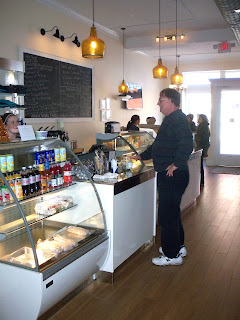
Over
the weekend, we had a chance to visit Lexington, Virginia, and our friends’ new
caffè and gelateria: Pronto. Pronto is Franky and Meridith’s third
restaurant and a testament to their love of Italian food, coffee and, of
course, gelato. Their goal is to offer
quick, fresh take-away you want to eat every day and an inviting bistro
atmosphere for those who want to dine in.
Franky
and Meridith are incredibly creative, smart restaurateurs, and I think they
would be the first to admit that establishing something new, in every sense of
the word, can be a bit of a challenge, even for the most fearless. But they definitely had a vision, and I was
thrilled when they asked for my help with some of the decorative decisions at
Pronto.
Starting
with a shell of a space can be daunting and liberating. And we knew the
right balance might be tricky to achieve. First, we wanted Pronto’s decor to acknowledge
its historic setting without any “quaintness”. And although the Italian cases and counters
are simply gorgeous, Franky and Meridith hoped to avoid a sterile interior
dominated by too much white and stainless steel. Finally, they planned to welcome folks of all
ages, morning until night, possibly even late-night during the summer, so we
needed sturdy, easy-to-clean materials and lighting to illuminate and provide
intimacy.We started with porcelain tiles that mimic hardwood planks.
We had considered mosaic or laminate flooring. But these long, lean tiles are absolutely perfect. They add warmth in color and texture. They seem contemporary… with a little nod to
the past. Their grain pattern helps
reduce slipperiness. The soft, slightly
aged color is imbedded in the porcelain clay, not applied to the surface, so
any future nicks will hardly be noticed. Plus, the small grout joints make cleaning a
breeze. And as you may have guessed,
these tiles come from Italy. You can
find something similar through Daltile’s Terrace Collection and Marazzi’s
American Heritage and Riflessi di Legno lines.
Pronto
is a deep space with huge windows along the street and almost no natural light
towards the rear. The ceiling is
unusually tall, and we knew we had to bring the light down to humanize the
dining areas, provide task lighting over the counter and illuminate the menu
sign. We also wanted a happy, ambient
glow. No black hole in the ceiling!
We
originally looked at those schoolhouse-style pendants you see in so many
renovations. But in the end, we opted
for fixtures that, I think, are slightly less trendy, starting with amber,
seeded glass pendants from Ballard Designs;
 |
| Addie Pendant in amber |
Shasta ceiling fans from Savoy House and Sadler track lights by Kichler;
and three Mini Barn Lights in matte black from Barn Light Electric.
Savoy House also supplied lights for the bathroom and office.
Using “off-the-shelf” lighting options fit our budget and tight time schedule.
We
chose a mix of restaurant-grade furniture, including larger round metal tables
for the front windows, small rectangular tables with simple pedestal bases for
the rest of the space, classic all-weather wicker bistro chairs and moulded
plastic chairs in chocolate brown. Everything
is really comfortable and functional.
The truth is that wooden tables and chairs would have cost less. But I think they might have looked rather old-hat, even when brand new. And we are hoping these more modern materials and forms hold up better, both visually and physically, in the long run.
As you may have guessed, our choice of paint colors was influenced by traditional gelato flavors… but nothing too icy or sweet. Benjamin Moore’s Durango Dust feels like a warm afternoon in the main area.
Palest Pistachio, in the bathroom, is really more gray than green and we like how it
continues the clean, silvery look of all the metals in the restaurant.
Meridith
specifically asked for subtle wall décor… no black-and-white photographs of
historic Virginia or vintage posters of the Italian countryside. And I always love mirrors. Three mirrors from Cyan Design have lovely
frames and reflect light throughout the restaurant. |
| The over-scaled Tangiers mirror feels like a window in this little corner. |
 |
| Detail of one of the Canterbury mirrors. |
And after a brisk walk around downtown Lexington, we returned for scrumptious gelato. Walter chose three flavors: chocolate hazelnut, coconut and banana. I splurged on salted peanut and banana. Yum!
Gelato is decadently rich, especially when compared to American ice cream, and more intensely flavored. At Pronto, Franky makes his gelato in-house, in very small batches with fresh, seasonal ingredients. It doesn’t sit around. Most modern ice creams include a lot of air, especially so-called low-fat or slow-churn varieties. Gelato seems thicker, creamier and denser, because it is. Ice cream is usually made with heavy cream and has a much greater butterfat content than gelato. Fat might be addictive. But it tends to mask, not enhance, flavors.
So, if you are traveling on Interstate 81 this holiday season, we hope you will stop off in Lexington for a caffeine, sugar and soccer fix at Pronto. (Franky broadcasts Italian Serie A and Premier League soccer games from around the world.)
Pronto is open 8 am until 8 pm, most days, at 26 South Main Street in the historic R.E. Lee Building. (540) 464-1472.


.JPG)


.JPG)


.JPG)

No comments:
Post a Comment
Note: Only a member of this blog may post a comment.