Showing posts with label fabrics. Show all posts

Friday, April 12, 2013

Green and Yellow: Alberto Pinto and Kathryn M. Ireland

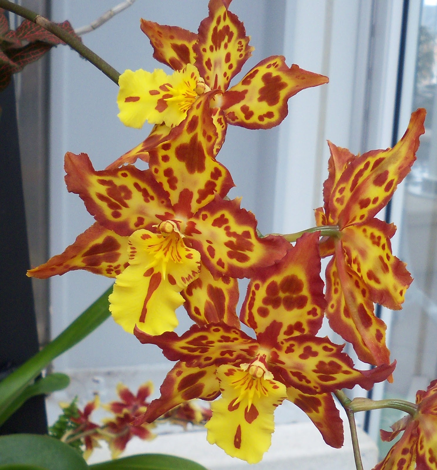
Last month, Walter and I visited Orchids Galore!: A Love of Living Color at Lewis Ginter Botanical Garden in Richmond.  It was more than a welcome respite from the extended winter-spring we’ve been experiencing.  The Conservatory was just filled with orchid blooms.  Some were romantic lady slippers;
others had flat, bright pansy-faces

or were strangely insect-like.
Many were slightly grandiose and worthy of old-fashioned corsages.
And they came in all sorts of colors: plummy browns,
luscious berries,
racy reds,
lipstick pinks,
and burnt oranges.

But I seemed to be drawn to ones that sparkled emerald and gold, smiled in summery lemon and lime and looked demure, even a bit hazy, in softer shades of jade and primrose.


They seemed to whisper “Spring is almost here” and hint at sunshine-filled days to come.


“Blue” is my predictable response to the perennial favorite-color question.  I tend to dress in varying tones of pink and red and brown.  And when helping others with their interior decorating, blues and greens or ivories and whites usually dominate.  But after our tour of Orchids Galore!, I realized how much I gravitate towards green and yellow in my own home… and in the work of others.
My rooms aren't quite as bold as this interior by Jonathan Adler!

But green and yellow crop up a lot... like in this vintage poster
in our otherwise sandy-red-and-French-blue bedroom.

Or the pretty combination of natural wicker and an olive-dark green print
from Pindler and Pindler that we've had for years.
(The rest of the room is creamy yellow, a couple pinks and red and brown.)

Antique Bavarian plates in the dining room showcase colors from
the Emerald City and Yellow Brick Road... but I think it's Hansel and Gretel, right?

And the guest bedroom sports Roman shades
in this old Laura Ashley paisley that we just love.
Two of my favorite designers: Alberto Pinto and Kathryn M. Ireland often use green and yellow with stunning simplicity.

Born and raised in Morocco, to Argentine parents, Alberto Pinto travelled widely in his youth and quickly established careers in photography and interior decoration.  He opened his own design firm more than 40 years ago.  Based in Paris, he and his team created rooms, even planes and yachts, which epitomized luxury and sophistication.  He was famous for his careful attention to detail and the grand scope of his commissions.
Alberto's dining room in his Parisian home
just glistens in darker-than-forest-green and golden woodtones.
And I don’t think anyone better understood the charm and livability of green and yellow, whether in an English castle, which feels intimate and opulent,
shimmering in a Geneva residence,
contemporary and serene at the Hostellerie de Plaisance in Saint-Emilion
or absolutely glamorous in Kuwait.
Alberto died unexpectedly in early November 2012.  But his sister Linda continues the exacting standards and palatial projects of Agency Alberto Pinto.

Kathryn M. Ireland was born in England, grew up in London and Scotland and moved to the U.S. almost 30 years ago.  After jobs in film and fashion, she started her eponymous line of lovely, somewhat feminine fabrics in 1997.
Kathryn's Quilt in Green
Kathryn’s decor is a little bohemian, pretty (without being too pretty) and completely accommodating.


Like Alberto, Kathryn regularly collaborates with other businesses, so in addition to her full-service interior design studio, she now has a collection of upholstery with Grange and new fabrics with Scalamandre.
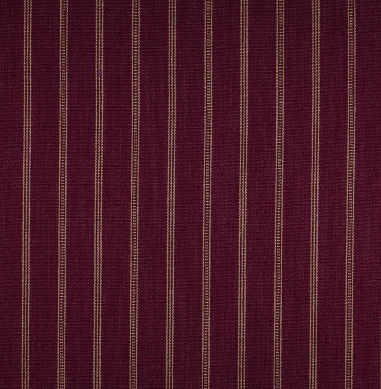
Pennsbury,
a jacquard velvet from Kathryn's collection for Scalamandre

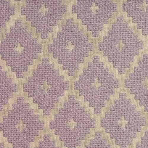
Senwick
an embroidered linen from Kathryn's collection for Scalamandre
And of course, she has gained a lot more attention as one of Bravo’s Millionaire Dollar Decorators.  You can shop for her textiles and antiques online or in person at her showroom in West Hollywood.

Although the formality of their styles is dramatically different, Alberto and Kathryn have obviously been inspired by other cultures.  They also share a penchant for layering patterns and colors.  They appreciate truly fine craft and know the power of beautiful objects.  Their designs reflect life well-lived.  It’s not really about money.  It’s about good food and friends and family, the chance to create beauty and joy in even the smallest of settings and the willingness to slow down and relish the moment.  It’s no wonder that, despite their world travels, both Alberto and Kathryn have called France home… at least for part of the year!

Of course, yellow and green is a universal combination, effervescent and tranquil: think of sun and grass; stone and leaf; pale moonlight and forest.  But it also seems especially rooted in Paris and Provence, Lorraine and the Loire valley, Aquitaine and Alsace.

Sugar, Sugar by Irene Suchocki
Le Petit Zinc by Irene Suchocki
I realize that few of us can afford the services of Agency Alberto Pinto or Kathryn M. Ireland Textiles and Design, but we can definitely read their books;

Alberto wrote several books, but Orientalism is perhaps the most fabulous.

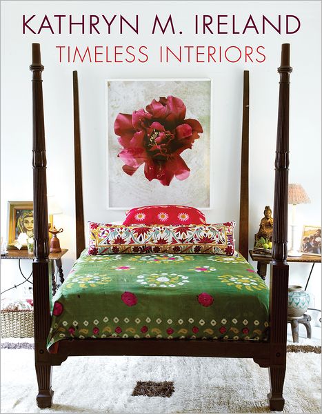
Timeless Interiors is Kathryn's lastest.
splurge on some pieces of Alberto’s tableware
Bread and Butter Plate from Les Perroquets from Alberto Pinto

Alberto's Envol pattern (Tea Cup and Saucer)

or Kathryn’s fabrics;


Tulip in Nuevo Yellow by Kathryn M. Ireland
Paisley Stripe in Green by Kathryn M. Ireland
Casablanca by Kathryn M. Ireland
and maybe attend an Extreme Balance Retreat, which Kathryn and friends conduct at La Castellane, her estate in southwest France.

I also encourage you to search out photographs by William Curtis Rolf, Rebecca Plotnick and the Robertsons at Obvious State (formerly known as Little Brown Pen).

And for a completely low-budget vacation, watch Midnight in Paris.  The first fifteen minutes is like a green and gold ode to Paris.  Owen Wilson is one of Woody Allen’s most charming characters, literally mesmerized by the city, past and present.  And in a party scene, you can just make out the lovely boiserie panels, in pistachio and gilt, at Deyrolle – the landmark taxidermist and natural curiosity shop.


By the way, Orchids Galore! closed recently, but you can still get your flower fix at the Smithsonian’s National Museum of Natural History, Orchids of Latin America, through April 21.  And finally, if you have a home project in mind, consider introducing green and yellow to your life!

Saturday, February 2, 2013

Purple Passion: Manuel Canovas

I know there are folks who adore purple.  It’s never been my favorite color, but my appreciation grows steadily over time.

For example, last summer I saw the most amazingly simple combination of plants.  Vitex agnus-castus, underplanted with purple-leaved Heuchera, separated by clumps of Perovskia atriplicifolia, all abloom at once, all thriving in an inhospitable stretch of highway median.  Looking velvety cool, despite the blazing hot pavement, probably at 130 degrees or more, and refreshingly delicate among the chaos of rush hour traffic.  The sight convinced me that purple should be the backbone of the new garden I hope to establish this year to replace my overgrown, faltering butterfly garden.

Purple shines in winter as well as summer.
Some plants shimmer despite the frigid weather.
Even the decorative cabbage is layered with purple tones.
It is old-fashioned and romantic,
Monet's Garden Trays from Two's Company
the color of Lilac, Lavender and evening skies, and pure energy and adventure.  Think of frosty morns and glam rockers.  Purple is decadent
Cowtan and Tout's Mackinaw is lush with autumnal colors,
but it's really the bits of purple that give it that extra something.
and exotic;
Thibaut's new collection, called Biscayne, includes this tropical floral.
Lucala in Linen and Plum
Detail of Lucala

Detail of coordinating Rinca wallpaper, also in Plum.
Both Lucala and Rinca come in printed fabric and wallpaper.
royal and rebellious.

And perhaps no one understands this better than the creative team at Manuel Canovas.

Founded in 1963 by its namesake, Manuel Canovas Paris quickly became known for textiles, both for fashion and home, in bold patterns,
As you know, I'm a big fan of chrysanthemum and Penelope.
Seen here in Prune and Rouge.
floral,
Bagatelle in Magnanese
chic and oriental;
Sultan in Fuschia
gorgeous rifts on traditional toile;
Bengal in Grenat
 
Cerisy (my favorite toile of all time), seen here in Prune,
is both warm and vibrant with a cream-yellow background,
ivory accents and rich raisin purple.
Bengal and Cerisy are available as fabric and wallpaper.
and stunning color combinations…
Byzance, a linen-silk blend, in Rubis
usually with shades of purple.
Although these are the "taupe" versions of Aurore and

Dara, they seemed infused with dark and bright purples.
Even without a lot of pattern, Manuel Canovas fabrics are sumptuous and heavily invested in purple.
Maroquin, in Cassis, is beautifully textured.

Safari in Lilas

Shetland, a wool-blend plaid, comes in several color combinations,
including Amethyste and Taupe.

Tamia in Parme is sturdy enough for outdoor use.
The variety of textiles, and how they are embellished, is extraordinary.
Fiesta in Amethyste... embroidery on linen-viscose
 
Nimes in Basilic... embroidery on viscose-silk

Silk Charlotte in the softest Mauve

And Bastide is a damask of fire-resistant Trevira fabric.
Seen here in Parme
And I love the charmingly descriptive names for purple hues.
Belem in Lie de Vin...
the color of wine.

Spritely Marly comes in the popular French color known as Parme,
which I think of as the hue of spring crocus.

Foch, a luxurious cotton velvet, comes in five shades of purple,
including Quetsche... a dark, luscious plum and

Glycine... like racemes of wisteria.

Zenith in Violine,

Vence in Oeillet

and Vallauris in Pensee, recall Deco-era resorts on the French Riviera.

Calypso in Fuschia and

Nautilus in Lilas aren't your usual beach-inspired patterns!

Tarascon, seen here in Parme and Violine, may be the perfect stripe.
Manuel Canovas is now one of the five brands that make up Cowtan and Tout, and Ariane Dalle, previously with Pierre Frey, leads the design process.  But purple, in all its glorious variations, is still a mainstay of the collections.
Champs-Elysee, a linen-viscose weave, comes in Raisin (seen here),
as well as Lilas and Violette.

Voyage en Chine in Prune

The chairs sport a cotton-linen weave called Ales...
here in Amethyste...
and the draperies are the finely-embroidered Beauregard.

Ales in Parme

Beauregard in Nattier Rouge or

Fuschia Rose.
I remember a pair of earrings and cocktail ring that my mother owned decades ago.  They were uncut amethysts.  The ring was large and almost liquid.  The earrings hung in long teardrops with posts, which looked like little seals of calligraphy.  I believe my father had purchased them in Hong Kong.  And although the set is long gone, I can recall how magical, how foreign and mysterious, it seemed to me when my mother would get dressed for an evening out or let me play with her jewelry box.
Le Cabinet de Curiosite in Amethyste
So as we head from January (garnet) to February (amethyst), consider adding a bit of purple passion to your home, preferably with something wonderful from Manuel Canovas.